
NGOs are Made of Data
Most NGOs have at their hearts data like primary research into the issues they are working to affect, data on the beneficiaries and clients who they serve and data about their own operations to help them increase efficiency, decrease costs and improve operations. NGOs are made of data. At least every NGO I’ve ever worked with is…
However, most NGOs are not yet doing a great job communicating that data to their constituents.
At the same time, publishers like the New York Times and National Geographic, businesses like GE and Twitter, political figures and thought leaders are producing sophisticated, well-designed, interactive and highly effective data stories.
There is a large disconnect between what audiences are becoming accustomed to and what they are getting from certain content providers. NGOs communicating to people who expect more visual and interactive content need to up their game when it comes to reaching these people — especially when communicating data-driven stories.
Party Like It’s Not 1999
Remember what websites looked like in 1999? And remember how special and sophisticated they started to become when the first “Web 2.0” sites started appearing in the early 2000s? And how behind-the-times older “Web 1.0” sites looked in comparison?
Right now, NGOs are living in a 1999 world when it comes to data communications. And it isn’t a party. A recent study on the memorability and impact of data visualizations found that governments and NGOs scored worst on memorability and effectiveness. How often do you see reports that are 50-page PDFs, which are mostly walls of grey text dotted occasionally…maybe…with an ugly Excel chart? Or even just a table with numbers!
Many NGO’s are beginning to recognize that data storytelling is a mission-critical skillset that will only increase in utility and value in the coming years. “We want to start doing it a lot more,” says Dan Marsh, Graphics Manager at Chemonics. “My supervisor and my supervisor’s supervisor — executive level people — are asking for more infographics because we want people to pay attention to our work. Infographics are more visually appealing and help us get peoples’ attention in a more compelling way.”
Proof is in the Pudding
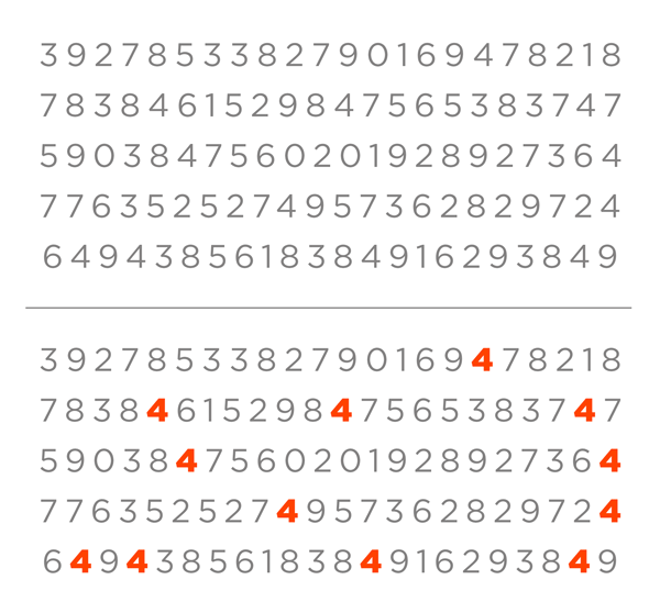
The field of visual perception looks at how humans process visual information. This field has given us a lot of insight into how and why visuals are so much more effective than numbers when it comes to communicating data. The simplest example is when presented with the images below and you are asked to count the number of 4’s in the first image. You have to “read” the numbers. That is a text-processing exercise. As soon as you turn it into a visual processing exercise, by adding more contrast and maybe some color to the 4’s, suddenly it can be solved in what’s known as a “pre-attentive” way. This speed and accuracy when it comes to processing visual experiences is one of the most fundamental reasons visual data is so much more effective than showing numbers alone.
But it’s not just the ability of your audiences to understand and remember the data. You are communicating for a reason — to raise funds, affect policy, win new clients or achieve some other tangible goal. There are endless examples of people having great success with data storytelling — improving web analytics, attracting new audiences, driving policy change, even launching entire publishing platforms built entirely on data storytelling!
But the key to success in all cases, is understanding what it takes to tell great data stories.
“For us, the value of doing a good data visualization is being able to take complicated data and emerge with a solid, compelling storyline”, says Susan Pleming, Head of Knowledge Products, Web and Communications for the World Bank’s Consultative Group to Assist the Poor (CGAP). “A data dump only works with a very narrow audience and is not usually memorable or persuasive. What people remember are good stories backed up by solid data.”
Beyond great stories, you have to create great visual experiences because they perform better than text-only experiences in many ways. Tweets with images get 2X the engagement rate of tweets without images, and I’ve seen client website analytics shoot up astonishingly across many key metrics after adding visual data stories. For instance, one client saw average time on site increase from about 3 minutes to more than an hour after adding an interactive data experience.
Now is the Time
I believe that 2016 is the year to expand teams’ capabilities communicating data because it is not a “nice-to-have” skillset — it is absolutely essential to break through the clutter, grab your audience’s attention and keep it focused on what’s most important.
Chemonics has been dabbling in infographics for about three years but recognizes it is time to up their game in 2016 because they see the way the communications world is headed. Dan Marsh and another colleague attended one of my workshops in Washington, DC, to learn “how to depict graphic concepts (especially data) in a compelling and creative way. I want to understand what type of graphics go with what kind of data and how to compliment the data with the right visuals without being cliché.”
World Bank’s Pleming reports that they have had great success with their recent data storytelling projects (disclosure: I created two recent projects for them) and plans to do more. “In our communications efforts, we strive to tell the financial inclusion story in a way that is compelling and understandable. Data visualizations are part of that strategy.”
Being Visual = Being Effective
One core way in which NGO’s can increase reach and impact is by communicating their mission, vision and results with funders, clients, beneficiaries, academics, the media and employees. Data storytelling is an extremely effective way — the only way, in many cases — to reach these audiences and maximize your impact.