
Data visualization is a unique field. You have people who self-identify as designers, programmers, data scientists, economists, statisticians, journalists, academics…and more…all who might define themselves as being data visualization practitioners. This is one of those rare fields with people who use both their right-brain and left-brain and come from various (apparently overlapping) disciplines like journalism and economics in ways that no other field I can think of really does.
For a long time I’ve been thinking about how many different professions are in this field who would normally not cross paths. And I’m starting to feel that a few of these “types” of people seem to be more prevalent than others. But I was curious to know, really, what kind of people do data visualization? Of course, I don’t mean that in the “what kind of idiot…” way that that question is often posed. 🙂
Seriously, I just want to know – are we a field of designers who have figured out some math and tech? Or a field of journalists who learned some software? Or some other too-shorthanded-definition? Or something far more complex?
Rather than tackle the complexity, I figured I’d start with a simple question. So I sent out a one-question survey asking:
How would you describe yourself in one title? If forced to pick one (and you are being forced to pick one), which of the following job titles would you be MOST LIKELY to use to define yourself? If you’re not a professional at any of these, but this is how you see yourself (e.g., you’re a banker but you think of yourself as a “designer” and come to your data visualization from a design standpoint first, pick that category (“designer” in my example). The goal of this survey is to see the self-defined categories people use in this field.
And I got a decent (given a quick Twitter/LinkedIn/Google+ blast) response and have a sample size of 95 respondents. Here are the quick results:
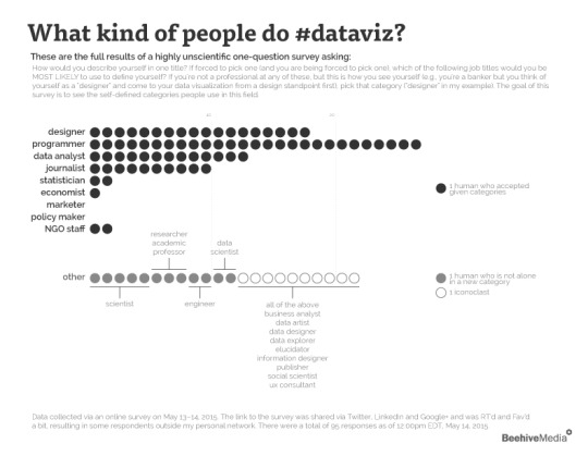
If you’re having trouble seeing this image, you can find a higher resolution version here: http://visual.ly/what-kind-people-do-data-visualization
So programmers, designers, data analysts and journalists seem to dominate the industry – or at least make up the majority of people who follow me on those social networks (and the followers of those who retweeted the survey and who were awake and online and paying attention at that moment and….) As data viz people, you know what I’m saying. This highly unscientific survey tells us something. But it certainly does not tell us everything!
It is interesting, but not definitive. It has sated my curiosity for the moment in that it reinforces my anecdotal experience that:
- Programmers, designers, data analysts, and journalists lead the field
Other top lessons for me:
- I should definitely have included scientist and academic as options
- I am surprised to see programmers clearly leading the list by such a large margin – my guess would have been designers would be at the top.
- I’m a bit surprised at how few economists, marketers and policy makers responded. But again, I think a broader sample size and survey distribution strategy might change that quite a bit!
While my curiosity is sated, and I have other important work keeping me busy, I do still wonder…who are we really? I would love to see a full scientific survey of the industry. What are our demographics, our training, job experiences? What technologies and design tools have we mastered and do we use? Where is the industry headed? Are we going to remain a field of a dozen types or will there be fracturing, specialization, consolidation…?
As more responses roll in, if things change significantly, I’ll post an update to these results.
Who are we? And who will we be in five years? Sounds like an interview question. I’d like to know the answer.
If you haven’t taken the survey yet, please do: http://bhv.io/WhoAreVizzers
P.S. Thanks to RJ Weise for a nice edit for a sentence I mangled in the original version!