Anna Karenina has one of the greatest opening lines in all of literature:
Happy families are all alike; every unhappy family is unhappy in its own way.
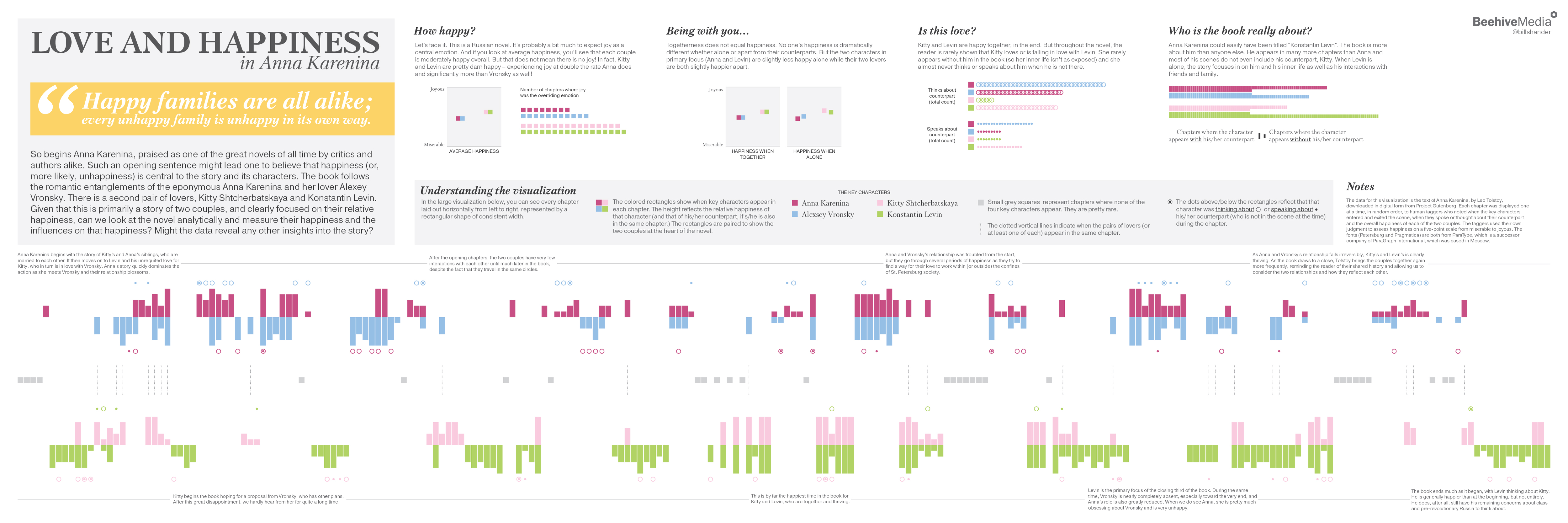
It’s a great line because it’s thought-provoking and so tightly written and clearly sets up an over-arching theme that carries throughout this Russian novel: happiness (and the lack thereof), especially around the romantic relationships of the eponymous Anna Karenina and her lover, Alexey, as well as between another couple, Kitty and Levin.
I read the book for the first time in 2015 and as I was reading it, I was also trying to learn Python and the Natural Language Toolkit (NLTK) and kept thinking it would make a great source of material for a project. It took me awhile – and several different runs at it from different directions – but I’ve finally created part of the infographic I had in my head two years ago.

At first, I had grand plans to do a deep investigation of the text using NLTK and to create a rich visualization covering a variety of themes. But I kept coming back to that opening line and realized that was my theme, in a nutshell. I decided to simply investigate love and happiness in Anna Karenina.
So I first gathered the data – simply measuring the overall happiness of the key characters on a chapter by chapter basis, and simultaneously capturing when those key characters entered and exited the scene and when they thought or spoke about their counterparts when separated from each other.
This data allowed me to investigate what makes the characters happy or not, how the two couples compare to each other (because it is clear throughout the book that these two couples, who are intertwined via a variety of connections, are meant to be compared to each other), and whether or not we can detect the love between the characters in the “data” (the text, viewed from the perspective of a data analyst, not just as a reader.)
With the theme and the data, it was easy to outline a static infographic that captured a very straightforward story.
My introductory paragraph establishes the thesis, and it is followed to the right by four key components to the story – looking from a 30,000-foot view at aggregated and averaged data:
- How happy are our characters?
- Does togetherness (between lovers) contribute to happiness?
- Can the data reveal love in other ways?
- Can the data reveal anything else, such as who the book is actually about? (It’s not really about Anna!)
The infographic is dominated, visually, by a large visualization of all of the data collected. You can investigate the entire book, chapter by chapter, character by character here. This is annotated with a few interesting points that are noticeable in the data, and also allows the reader to make some of his/her own conclusions that may not appear in my summaries. This visualization was very challenging to design because I wanted to emphasize the relative happiness of characters, while allowing the viewer to see the pairs of lovers and compare the pairs to each other. This is harder than it sounds, it turns out! And with the added desire to show when characters are thinking/speaking about each other and allowing the user to quickly see when the couples overlap…This design went through at least a dozen iterations, in sketches, in code and in Adobe Illustrator, before the final design was complete. (Note: I used D3 to create the visualization in code to ensure the elements were appropriately sized and placed, and then downloaded the resulting SVG to work on manually in Illustrator.)
One thing to keep in mind is that the data collected is subjective. While it’s possible to measure happiness on a chapter by chapter basis using machine learning and text processing (as in this great project out of the University of Vermont), it is not possible to automate the process to figure out the happiness of specific characters or when a character is speaking or thinking about another specific character when s/he is not in the scene. So I hired human content taggers to read a chapter at a time and assign the happiness levels and capture the other data. I spot-checked about a dozen chapters and found the results to be reasonable, but one could argue against the data. (If I continue this project and investigate other works of literature, I will probably have multiple people read each chapter so I can average the scores, rather than relying on one person at a time.)
I look forward to hearing what people think of the infographic and the story it tells. If you want to buy a poster of the visualization, you can order one on Zazzle! And if you want to boost your own skills, check out my data storytelling workshops which I bring to cities around the world.
If you would like a more in-depth explanation of how I created this infographic, which was a roundabout process (!), read this “making of” article!