
Do you remember when people were bemoaning the horrible new scourge known as “Infotainment?” The word first appeared in the 1960s but became ubiquitous in the 1980s with the launch of MTV. If MTV News was the epicenter of “Infotainment,” then anchor Kurt Loder was the face of it. I grew up watching Loder and thought he embodied a harbinger of good things to come in journalism because he and MTV were acknowledging that their audience had different expectations from the media.
The fact is that we demand (more so every single day) to be entertained. But it’s even simpler than that. We like pretty things. We like pretty people and pretty objects and pretty ideas. Even ugly beats forgettable these days. Whatever you do, don’t bore me!
I would argue that there is a strong ‘Eye Candy Imperative.’ Making beautiful things is no longer a luxury. It is mandatory. In other words, aesthetics matter.
One of my favorite projects (and now a book) from 2016 is Dear Data. This was a collaboration between two information designers, Giorgia Lupi and Stefanie Posavec, who sent each other postcard sketches of personal data each week for an entire year. This project is interesting and inspiring on many levels, but especially in the context of eye candy. Why? Because none of the 104 postcards were standard ‘charts.’
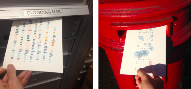
Each is a unique and bespoke view of some data set. Each is eye candy, in that it is a beautiful and interesting expression of data. Each is “infotainment,” in that it is information (data) and entertainment (artistic expression). And as I’m arguing, they are a beautiful confirmation of the power of eye candy to move your audience. This project has caught the information design world by storm and is even leaking into more general press outlets like Slate and Quartz.
Eye candy serves three primary critical purposes in design:
- It keeps things visually fresh and interesting
- It can draw the eye to what’s important
- It can alert an audience to functionality
One of the arguments against eye candy is that ‘serious’ people question whether eye candy detracts from the importance of the subject or, worse, might render a design less useful or inaccurate. Research proves this isn’t true. One study out of the University of Saskatchewan investigated the concept of “chart junk,” which are embellishments that aren’t necessary to understand the information being charted, famously coined by Edward Tufte who is not a fan of eye candy, to say the least. That study was interested in determining whether, as Tufte said, chart junk is a bad idea.
The study found that chart junk has zero detrimental effects — accuracy of understanding is not diminished with ornamentation and, in fact, the ability to recall the information was much better with “chart junk” visuals as compared to those without added flare.
Another study researching the effect of aesthetics on usability in data visualizations found that users prefer “pretty” charts — the best example being the Sunburst chart — even though they often don’t really understand how they work. The study also found that people will spend more time with charts that they like, learning how they work and their accuracy of understanding does not ultimately suffer. So there is a strong argument for using aesthetically pleasing visualizations even when simpler “more effective” charts may be available for your data.
In other words, you should strive for the purest and fullest embodiment of form and function. Make beautiful, interesting, animated, and innovative fresh things. Push that envelope, draw your viewer’s eye, force them outside their comfort zone a bit. Just remember to be careful — consider usability and your ultimate communications goals very carefully as you design your eye candy.
To learn more about data storytelling and information design, join my growing community where I’m always curating great content on the subject.
This was originally published on the Infogram blog.