In honor of the 50th anniversary of Woodstock, I created a data visualization of every data point I could find about the event. This project was full of interesting twists and turns along the way. This post is both a showcase of the project, as well as an explanation of what it took to bring it together. There were a lot of disasters learning opportunities along the way, right up until the very end!
First, the final piece. Below is a full zoomed out view of the entire final output. I like it. It looks pretty nice. Unfortunately, I was so enamored with the design and the process that the final piece is all but useless as an online experience. While it looks nice from this zoomed out position, it is SO HUGE (and circular) that you need to zoom way in (and rotate it) to be able to read all of the detail. And there is a lot of detail worth consuming. The image below won’t allow you to explore.
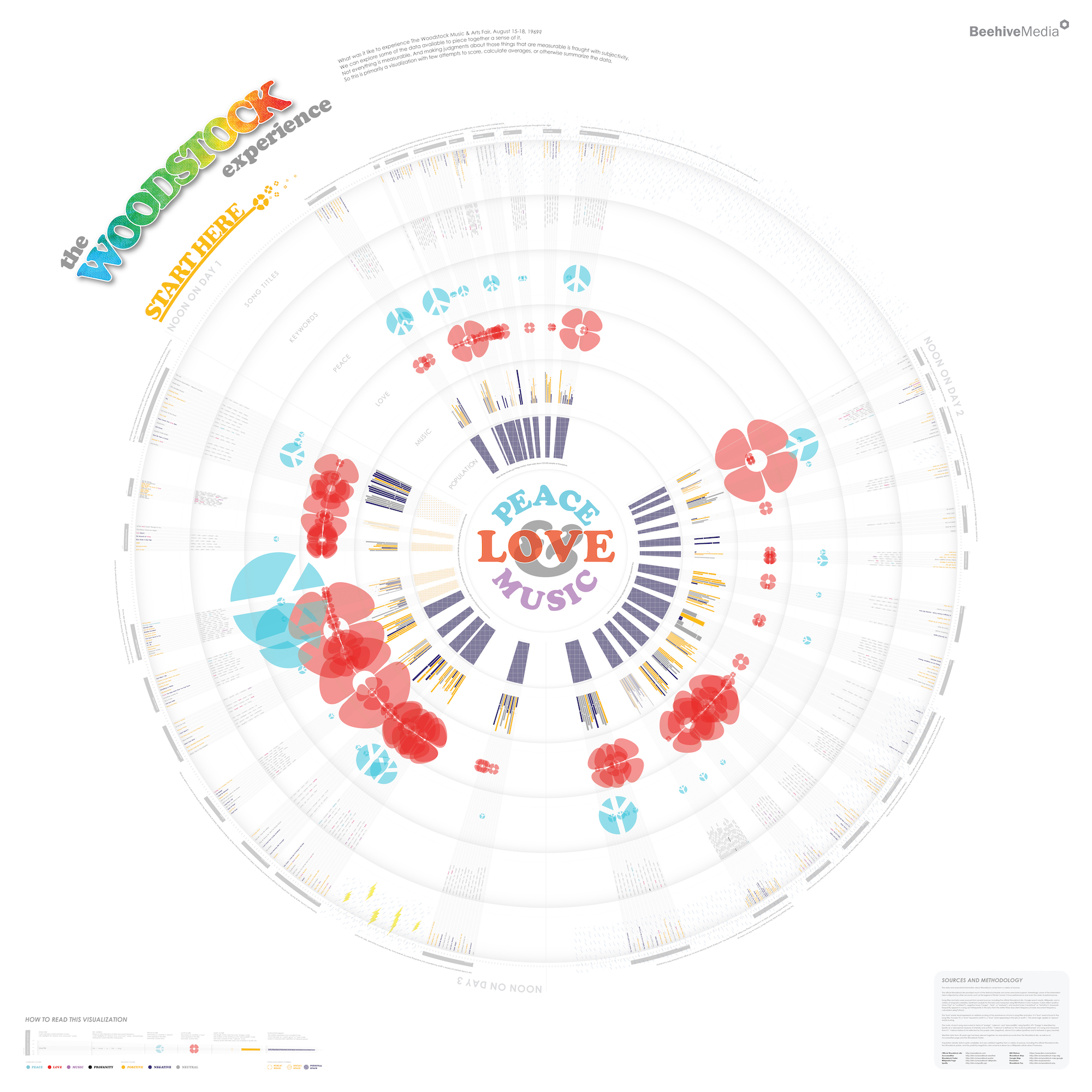
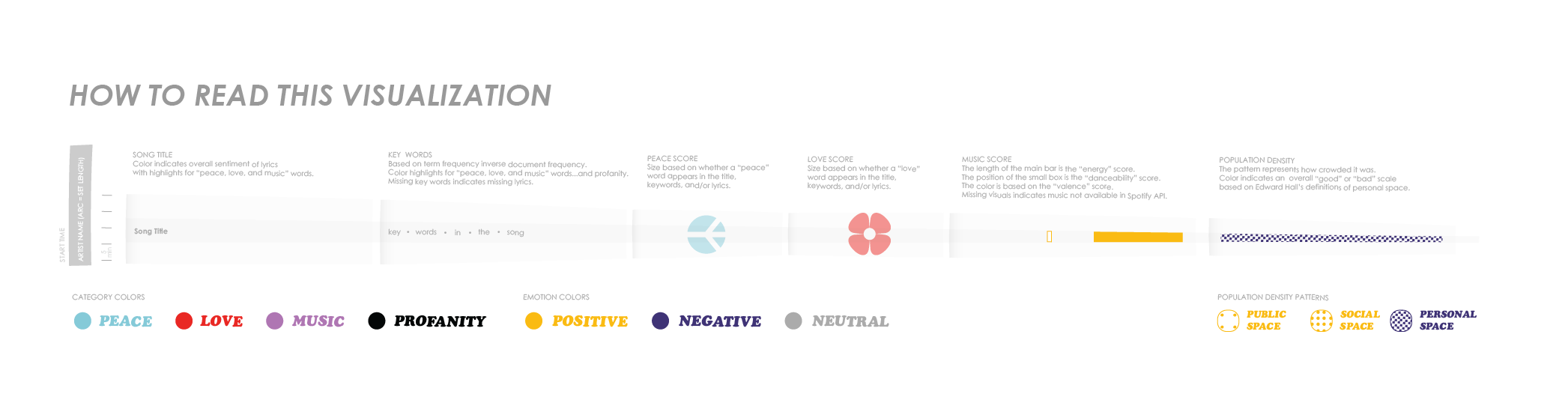
Here’s a legend for how to read it:
This zoomable version will allow exploration. But you need to use the tools to zoom and rotate to really check out all the nuance of the data.
OK, so the first problem is that the final output (so I guess that’s really the last problem) is not very consumable for an online audience. BTW, I knew this early on but decided that I wanted to create a printable piece for potential placement in an exhibition of some kind. I knew what I was getting into. (If you know of a museum or art gallery looking for a piece to exhibit…reach out!)
The Idea
Let’s go back to the very beginning. I loved the idea of trying to capture what it must have been like to be at Woodstock. The music, the weather, the overall vibe of the place. My first task, therefore, was to define what that means and translate that into data that I could try to track down. There were things like when different artists played, what they sang about, how the music felt, how crowded it was, the weather…so much potential data! This seemed like a solid creative exercise that would be fun to put together for a deadline-driven event. I had plenty of time to pull it together too (I started in January, 2019, and the anniversary wasn’t until August.)
The Schedule
There were a ton of artists who played at different times of day, playing different types of music, about different themes, using different language. All of this is data – time and length of the set, the tone of lyrics and the music itself. Easy!
Wrong.
Even something as simple as the artist play times is heavily disputed. One of the great legends of Woodstock – that traffic jams delayed the start of the festival, so Richie Havens had to jump ahead in the set list and “played for three hours” is likely not true. The official Woodstock site perpetuates that legend but alternate sources indicate he played first, yes, but played a regular set. This was my typical experience on this entire project – source some data, find conflicting data, and try to just figure out who to trust and whose data to use in the final graphic. (The final output likely contains a lot of errors and certainly many guesstimations.)
The graphic includes anecdotal explanations of many incidents throughout the event, including a nod to this disproven (?) legend.
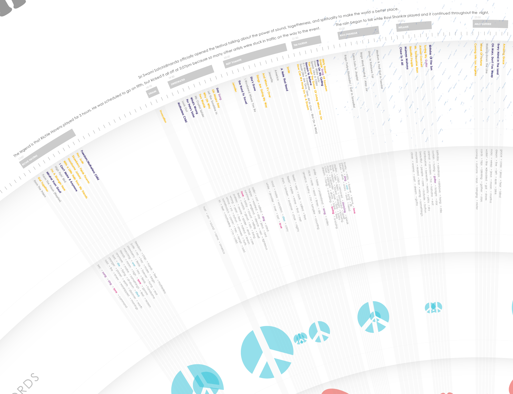
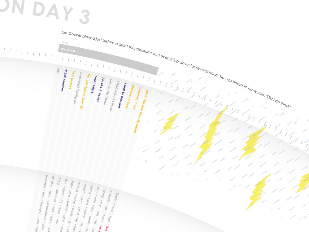
You’ll notice that for each artist, you can see every song they played, and an average song length (the arc length the song occupies around the circle.) There was no way to find out how long each individual song was, so each song in the visualization is just a proportional share of the entire set length. This was one of so many small decisions that had to be made because of bad or missing data.
The Words
Each song title’s color represents the overall positive, negative or neutral “tone” of the song. Is a song’s lyrics happy or sad? Thinking about how to tackle this fair question was one of the first technical choices I had to make. After considering and testing many technologies (manually detecting tone with something like Python’s Natural Language Toolkit or using an existing API), I decided to use IBM Watson’s tone analyzer API. Each song’s was run through the API and I simply took the tone results (words like “joy” and “sadness” and “analytical”) and coded them as positive or negative or neutral. It’s pretty reductive, but gets across the gist of it. For 300+ songs, and a lot of other data points to consider, this felt like a logical choice.
The Music
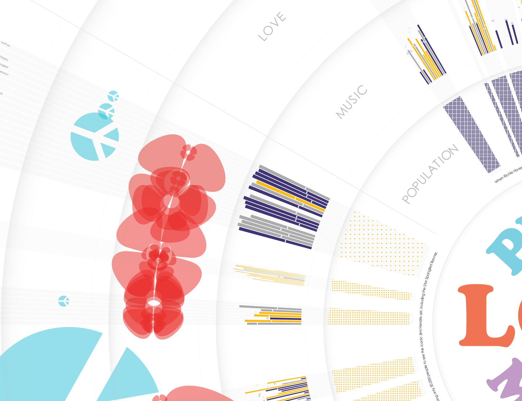
But the effect the music has on an audience isn’t just based on the lyrics. The music itself is at least as important. After much technical consideration, again I chose a major API to do the heavy lifting for me. I used Spotify’s API to pull various measurements of the music itself. I decided to focus in on every song’s “energy”, “danceability”, and “valence” score and created a simple visualization to capture each. Bar size represents “energy”, the little cross-hatch indicator is “danceability” and color once again represents positivity or negativity of, in this case, the “valence”. You can see Jimi Hendrix’s set in the image below – just to the left and down from the word “MUSIC”. His music was very high energy, not very danceable, and just one song had high valence.
Originally, I had a big question: which affects the overall experience more – the lyrics or the sound of the music? I was going to create some sort of algorithm so people could play with their own answer to that question and see some sort of overall score (I don’t hear lyrics, just music, so the algorithm would ignore lyrics and make the importance of the music tonality much stronger for me, for example) but I abandoned this very quickly for a few reasons:
- I pulled lyrics from a variety of sources and I’m not 100% confident in the quality/accuracy of the lyrics for each song. As an example there were a TON of spelling inconsistencies!
- I automated the process of finding Spotify links for every song based on the song titles, but there were MANY songs I had to dig up manually. In some cases, I was able to find the song but it was performed by a different artist. In some cases it was a performance by the same artist and occasionally, even the actual Woodstock recording. But clearly, to declare the music as representative of what happened those three days in 1969 is a stretch, song by song.
- What should this algorithm even look like if the data were perfect? Do I multiply the various score numbers, add them together, perform some other complicated math? There are 3 music scores and one lyrics score…should I take the average of the 3 and do something with the other one…? I’m not a statistician, economist, social scientist, etc. I’m not qualified to validate any methodology like that so I chose not to do it at all!
Peace, Love & Music
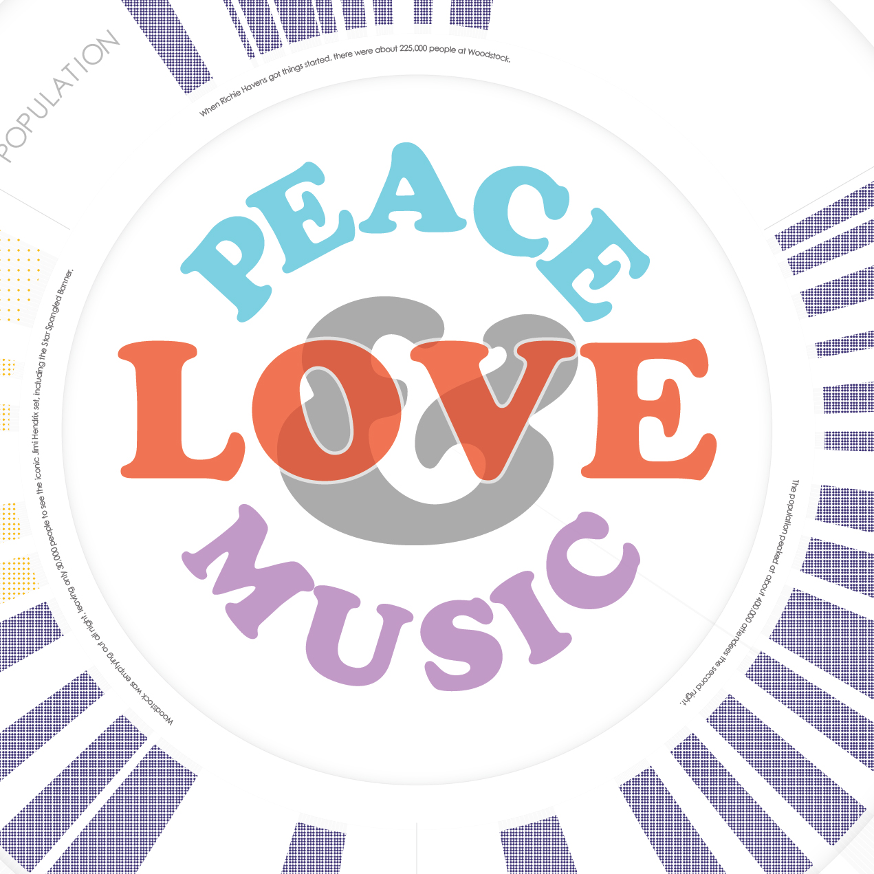
Was Woodstock really about Peace, Love, and Music, as advertised? One way to figure that out was to examine the lyrics for “peace”, “love”, and “music” words. I did break out some Python for this task. I took the lyrics and calculated the Term Frequency Inverse Document Frequency (TF-IDF) for each song to generate the top 5 keywords for each song. These are all shown in the graphic. Any time a keyword includes one of those three categories of words, it is colorized. (I also used color to pull out profanity, which was surprisingly rare!)

But was the festival REALLY about peace, love, and music? I still couldn’t say (well, it was about music, obviously, but how about peace and love?) I really wanted to know. So I did decide to do some scoring. And I could be criticized for HOW I scored things, but I just had to make a decision. For each song, if it mentioned any of those categorized words in the lyrics, it earned one point for every mention. If one of the identified TFIDF keywords was one of these words, it got five points. If one of those words was in the title, it earned ten points. With each song scored, I could visualize the overall impact as seen via the flowers and peace signs visible in the zoomed out view.
There was a lot more peace and love on day three than the earlier days, FWIW.
Population Density
I also explored population density. It was very crowded for most of the festival, though by the time Jimi Hendrix played at 9am Monday morning, the crowd had dwindled to just 30,000 or so people. The population data was extremely spare. I used the population numbers I could get, and compared that to the space available by overlaying a hand-drawn festival map over Google Maps to calculate rough square footage for each person.
I’m not at all confident in the accuracy of the numbers and associated timing for the population numbers themselves, which is why I don’t get very specific about the data in the visual. I simply broke it down into three categories – “personal space”, “social space”, and “public space”, as defined by Edward Hall.
Weather
Weather data was equally difficult to come by. However, anecdotal reports, the official Woodstock site, and some other sources gave me some clarity around when it rained and, in some cases, how hard. TLDR: it rained A LOT.
Design
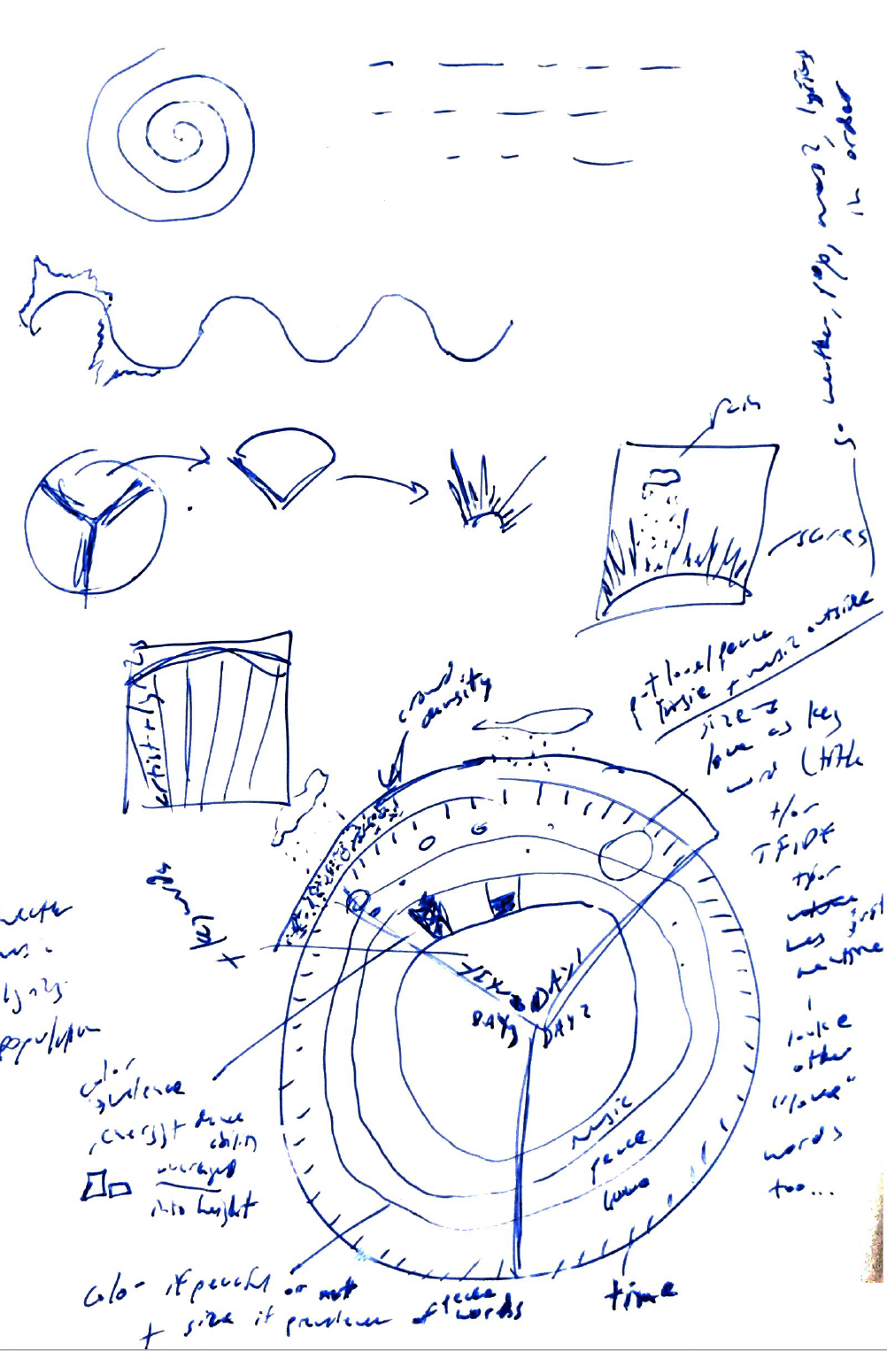
The design process was pretty schizophrenic. I generated dozens and dozens of sketches of all shapes and sizes. I had ideas for interactive pieces, small infographics, and everything in between. I kept circling back to the idea of a radial diagram. I couldn’t get it out of my head. So I ran with it.
Technical Process
The technical process was intense. First of all, I had to collect the data. This was a combination of manual and automated processes. I got the list of artists, songs, and play times from a variety sources and they formed the basis of a spreadsheet to house all of the data. To this, I added lyrics, which I was able to pull via web scraping for about 1/3 of the songs, but the rest was copy/paste. And I did a TON of fixing if typos as I noticed errors.
Next I had to get the scoring in place using IBM Watson’s Tone Analyzer API, which I did via PHP script. Queries to the API were posted one at a time and then results were saved to a MySQL database in my dev environment. A similar process was used to pull data from the Spotify API for each song. But before I could even do this, I had to identify each song’s unique Spotify ID, which was its own script to auto-detect as many as I could (less than half) and then I had to manually search for the rest and add them to my database manually.
Then I generated a text file for the keywords (using Python to calculate TFIDF), which was then merged back into the MySQL database.
Finally, I wrote D3 code, which queried the MySQL database (via a PHP script that pulled data out and put it into JSON format), and turned that data into the primary radial diagram with the artist play times, song titles, keywords, peace and love scores, music visualizations, and population density patterns. After generating the overall visual, including the colors, I used SVG Crowbar to download that SVG.
One interesting note on this process. I discovered some odd errors with D3 and SVG exporting along the way. The best example is that when you use text on a path (in D3) and then download the SVG using SVG Crowbar, something odd happens to the text. It looks perfect on the screen, but the downloaded version brings the text in as individual elements rotated weirdly. So rather than text placed as you want it, the text may look and be placed completely different. I had to change all of my text on a path objects (artist names and song titles) into standard text. To figure out how to rotate and place them where I wanted them required some experimentation (and trigonometry!) But that wasn’t too hard to solve, thanks to Google, Stack Overflow, etc.
All of the rest of the content, and a host of design tweaks, were hand-made in Adobe Illustrator on top of that code-generated SVG file. This is a short paragraph, but believe me, this was hours and hours and hours of work. And included going back and tweaking code, re-generating the automated parts dozens of times, etc. The final mile is often a tough slog. (And usually rewarding!)
In Closing
This was a large, complex, tech-heavy, data-poor, challenge-rich project. I made dozens of small decisions along the way that I can’t capture well even in a long post like this. It was very rewarding and I’m pretty happy with the outcome. Although I really wish the final massive print piece had a place where it could live and be viewed by more people. The online experience doesn’t do it justice. But I learned more during this project than in just about any other project I’ve ever done. And for that, I’m grateful!