Some people seem to think that data visualization has to be extreme, fancy, complicated and dense. I’ve seen visualizations that are incredibly beautiful and awe-inspiring as a design or programming portfolio piece. But they do little to illuminate the subject at hand.
The other end of the spectrum is the lowly bar chart or pie chart. These basic forms of data visualization are, in fact, useful and should never be ignored. In fact, sometimes they are the right visualization for the job.
I just created a new visualization to illustrate the data from a survey on how consulting firms are using social media. Conducted by the Association of Management Consulting Firms, The Bloom Group and ResearchNow, it reveals a lot of interesting data and trends in the industry’s use of social.
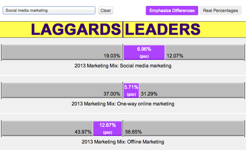
Perhaps the most interesting is the difference between the Leaders and Laggards. Leaders are those whose thought leadership programs generate more than 30 leads per month and Laggards generate fewer than ten per month. Without getting into the research itself (you can read about it on The Bloom Group’s site and see the visualization here), I want to explain my reasoning for the approach to the visualization.
Leaders vs Laggards
My first question is always “what’s the story”? And the story here is definitely Leaders vs. Laggards. So the key thing the visualization had to achieve was to display the gap between the two. A simple bar chart could have displayed this – the difference between the heights of the bars is clear. However, the difference isn’t as visible for two bars when one is 6% and the other is 3% unless you set the y scale to a low number, which is a bit disingenuous – especially in a format people are used to seeing in a certain way.
So I decided to create horizontal bars that originate on the outside edges and animate inward, on a proportional scale (so whether it’s 6% vs. 3% or 60% vs. 30%, the bars always meet in the middle.) Because it’s a non-traditional format, I think people will forgive the scale adjustment. And the numbers are clearly visible so you can see that you’re not looking at a 100% scale. The gaps are highlighted to reveal the difference between the two. This makes it obvious that 6% vs 3% is a 100% variance, and 36% vs. 33% is a much closer gap, even though in both cases we’re talking about 3%.
To make it really clear that this is not some attempt to over-emphasize the differences while discounting the real percentages, you can also view the data using a more traditional 100% scale view. In this case, I made the bars originate in the center and animate outward so you can see them next to each other and more easily see the difference in size between the two.
Compare What You Want to Compare
The other key feature of this visualization is the ability to view more than one set of bars at a time. Rather than pre-package the data in groupings (showing all the 2013 data or all the data for a specific question, for example), the user can choose which sets of data s/he wants to compare and can look at as many at a time as s/he wants. This makes it a very powerful comparison tool while reducing restrictions placed on the user.
Simple, traditional shapes, nothing fancy really, but a powerful tool to see and clearly understand the data at hand. Play with it yourself and let me know what you think!