
image:
Storytelling is one of the most important evolutionary advantages humans have. That is a bold statement, but I believe it is true.
When ancient man sat around the village fire, telling stories, they were teaching other villagers where to find food, how to successfully capture game, what herbs cured diseases, which animals to avoid (and how!) and other essential survival skills.
This information wasn’t shared in a village newsletter or safety posters on the cave walls (well … I guess they kind of were like early posters … but you know what I mean). Primarily, these lessons came in the form of stories.

So for tens of thousands of years, this is how humans have learned the most important things from each other and, therefore, this is how we expect to learn from each other.
Numbers Freak People Out

And everyone knows how to tell stories. We all spin a yarn here and there. We know how to tell a joke, build suspense, tell a flowing narrative around a weird vacation anecdote or about our kids’ ballet class.
And yet, for some reason, as soon as most people have to communicate numbers, they freak out. “I hate math! I don’t get numbers! I have data to share … what should I do?!? I know, I’ll just throw all the numbers on a slide and hope for the best. Everyone else will figure it out…”
Does that feel familiar? You’re not alone. We have a serious numbers phobia in our culture that turns many people–especially professional communicators–into nervous wrecks!
But just as cognitive behavioral therapy can help solve problems with a variety of phobias by facing fears head-on, I believe everyone can learn to communicate data in a similar way–by doing it. Simply the act of trying, and practicing, can make any communicator into a data communicator.
One of the most important tactics is to come at data communications from a storytelling standpoint. Not only because storytelling is so powerful and the best way to connect with many audiences on many subjects, but because we all know how to do it, deep down, so it helps turn intimidating numbers into simple ingredients for stories.
Weaving a Narrative from Numbers

One of the most important steps you can take to turn numbers into narrative is to outline or storyboard your story like you would any other story, ignoring the data itself, and focusing on the flow of the arguments. For instance, say you have data about your company’s sales and you need to make a report for your CEO. What do you do?
First, you figure out KWYRWTS – my acronym, which is the worst acronym ever, but stands for a really important idea: Know What You Really Want to Say.
So let’s say your sales figures are way down this quarter. But you know the main reason is because your European office had a huge dip in sales due to the debate around and subsequent passage of the Brexit referendum. Clearly that is going to be the focus of your story. That’s your KWYRWTS. Maybe there are two main points, or three, but you have to know exactly what they are!
So you create a storyboard and decide the narrative flows like so:
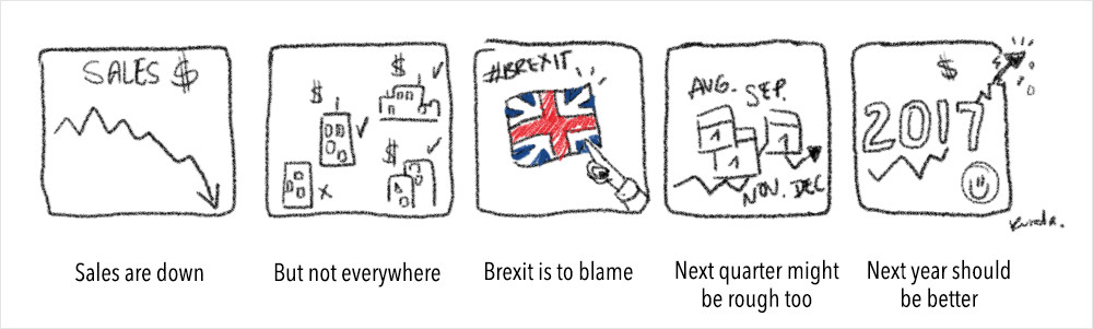
This five “panel” story sets up a flow and logic around which you can easily weave a narrative. You know you’re opening with “sales are down,” which will likely include an overview of company sales. You’re building some anticipation, activating emotion in your CEO (hopefully not anger directed at you – maybe some anxiety on his part!).
Then, you will shift the story to a relief of that anxiety by showing the regional numbers, alluding to some good news? Or at least some information that might help support solutions. Next you get to your hypothesis for the problem, which is a logical build from the regional story. Then you go into future-telling, focusing on the near future (next quarter) and then the longer term (next year), which allows you to end on a happy note–a Hollywood ending, of sorts, for your data story!
Only once you are very confident in your story, do you worry about getting the actual data and thinking about what charts to show, and how. In other words, I needed to understand the gist of the data to know what story to tell, but I didn’t need a lick of actual data to outline a compelling story that would explain what needed explaining AND present the information in a way to maximize my impact on the CEO.
This very simple process of simply outlining a basic linear story based on buckets of content is an extremely effective and pretty easy way to squeeze a narrative out of a pile of numbers.
By the way, hidden in this, is a very clear understanding of my audience. I know my fictional CEO is not going to blow her top with a bit of bad news – I’m sure she already knows it anyway. And I also know she’s mostly curious about the reasons for the drop in sales and whether we can make any predictions about the future.
So I’m weaving the story in a way that will quickly get to reasons and then to predictions. I also know that she expects unvarnished honesty, so being clear that next quarter might not be so great is important to include, while also providing a ray of sunshine at the end.
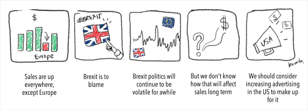
For another boss, I might have told the story differently:
Just Don’t Freak Out
You already know how to tell stories. Know what you’re trying to say, inject emotion and suspense and interest into your narrative when possible, outline your story’s flow, ignore the data until the very end of the process and only then worry about what specifically is included and how to visualize your data. The best advice? You’re telling a story with numbers. Don’t freak out. You’re telling a story…with numbers – they’re just ingredients!
To learn more about data storytelling, just check out my data storytelling course on Skillshare.
This post was originally published on the Visme blog.