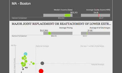
I recently submitted an entry to a data visualization contest sponsored by the Robert Wood Johnson Foundation, Health 2.0 and Visualizing.org. The challenge was to create a static or interactive visualization of data on hospital pricing provided by Centers for Medicare and Medicaid Services. I’ll find out in mid-September whether I won, which could mean some cash and, more importantly, an opportunity to present at the Health 2.0 conference.
My entry takes the point of view of a consumer looking for care for him/herself. I wanted a tool that would make it easy to see relevant data to help me find medical care based on quality and pricing.
What’s nice is that I’ve already had some good market validation for the visualization. It was picked up by Reuters and Popular Science last week, which has led to a good amount of traffic to the site! It was also selected as a Featured Visualization by Visualizing.org and when I cross-posted it to visual.ly, it was chosen as a Staff Pick there!