People are dying. The economy is collapsing. The world feels like it’s falling apart. This is no time to be capitalizing on the misfortune of others, even to hijack a popular subject and inject non-essential content around it. (Never mind what some craven individuals are doing to exploit it.) And I won’t divert attention for more than a moment. But it is worth pausing, from the perspective of people who care about data visualization, and remarking with awe at the moment that the practice is having.
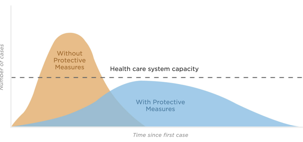
No visualization in my memory has ever had the impact, been as widely referenced, become part of the daily lexicon, had its story so broadly told, HELPED CHANGE BEHAVIOR like “flatten the curve” has done.
And it’s not just “flatten the curve”. The Washington Post published a fantastic simulation to explain the incredible impact social distancing can have on the pandemic. None other than Barack Obama himself shared it, to help explain and enlist the country’s support for this important behavioral change.
Watch this. It shows why we should all do the right thing and stay home to the fullest extent possible. All of us can help slow the spread of the virus, protecting the elderly, the vulnerable, and each other. https://t.co/FgffQrMVB7
— Barack Obama (@BarackObama) March 15, 2020
Long story short, as a practitioner, teacher, and fan of data visualization and data storytelling, I’m very proud of my peers and the work they’re doing to help address this crisis. It’s making a real difference.