This was a mild winter by every measure on the East Coast of the US, where I live. We had a few cold spells, but we also hit 70 degrees in February more than once. We hardly had any snow, which meant the skiing was terrible, which was the only real downside. My wife would say that’s not even a downside!
Then came March…like a Lion, as the saying goes. We had a Nor’easter (NOR-EAST-UH, as a true Bostonian would pronounce it!) For those unfamiliar with that term, it means a rip-roaring wind-storm coming in from the Northeast rather than the West, which is the source for most of our weather. This means the wind and moisture are coming off the ocean, which often makes for the fiercest storms. You can have hurricane-force winds with a Nor’easter and if it includes snow, these storms can dump the white stuff by the foot.
Anyway, we had a Nor’easter on March 2 and then another one on March 7. The second one is the one that affected me. We lost power for 36 hours (so far – I’m writing this during the outage because I can’t get online and do some of the other work I should be doing RIGHT NOW!) And it got me wondering – who else is without power right now? Where are the crews right now? When will my power be restored? And this is an opportunity for a data story that my power company is definitely missing out on.
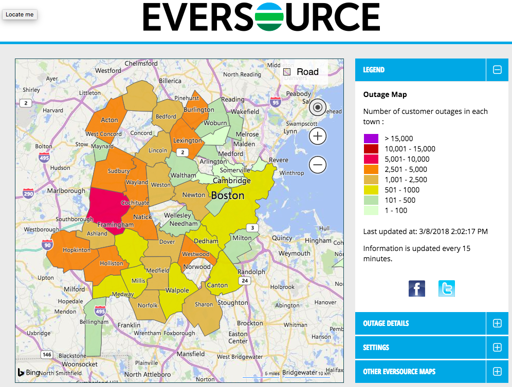
My questions are clear – and pretty obvious. So how would you solve this with a data story or even a simple data dashboard of some kind that might help? The most obvious answer is that you would want to produce a map where someone could see the outages. This makes perfect sense. And my power company did that! Good start but…is this map helpful?

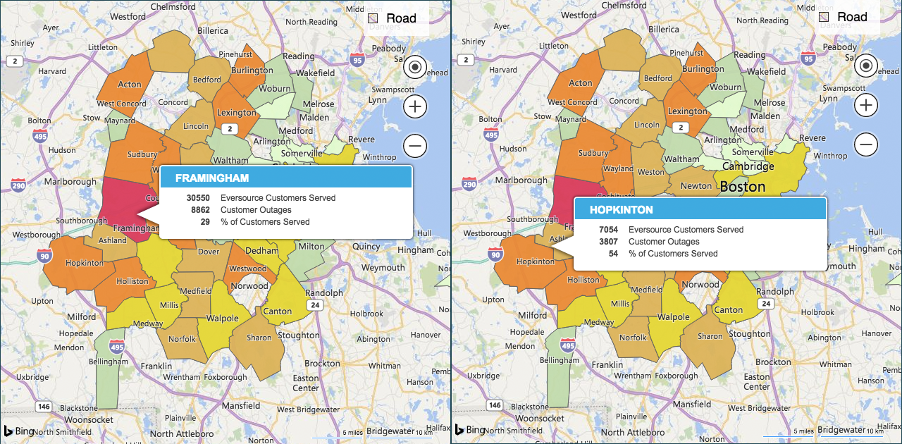
I will argue that it is not. First of all, this is as detailed a map as I can get. So I can see my town. And I can see that in my town, 2500-5000 people are without power. But that’s not very useful. Mildly interesting? Sure. Useful? No. And, as the color scale indicates, I can see the total number, which makes the one pink town (Framingham) look like it’s a disaster. However, when you rollover the towns on the map, you see that only about 29% of Framingham’s residents are without power, whereas in my town, Hopkinton, it’s 54%.
So even this mildly interesting map isn’t immediately communicating the most relevant number to me (the curiosity is more about percentage than total number – to me, at least.)
But that’s not where this map is really failing me. What I want to know is where is the outage in my area specifically? If I could zoom in on Hopkinton and see street by street which areas are without power, it would give me a real sense not just of the size of the impact, but the locality of the impact. If every street within 3 miles of my house were out, and if the map even indicated a transformer that was blown and/or a power sub-station facing issues, it would give me a much better sense of how long I might expect to be without power. And, even more helpful, it could show me little dots indicating the location of crews in real time, so I can see if they’re working in my area. This would really help me make a guess about how long before I see my lights (and internet!) turned back on.
Perhaps it could even include a future-forward prediction (like weather maps that show how a storm will move in time beyond now) of when they expect crews to move on to other locations, along with estimated fix times. They could include lots of caveats so no one holds the company to those timelines explicitly. This transparency would reap dividends though there will always be some cranks (like those who criticize weather reporters when the storms shift at the last second) who might complain when some predictions end up being too rosy.
All of the data I’m suggesting is available. The company knows where it has outages and you can bet it’s all in a computer somewhere. The reporting system for outages is fully automated – via computer and/or phone. And you also know they know where their crews are. I’m sure there are multiple databases with everything they would need.
A Data Story
So a data dashboard is an obvious opportunity. What about a real data story? What might that look like? What purpose might that serve?
Imagine this:
The company produces an article with interactive and animated visuals that they run on their website and make available to local newspapers as a tool. The story is an after-action review of the storm and their process of returning power to the 350,000 people who lost power. This is an outline of how it could flow, along with a description of the associated visuals it could include.
- On March 7, a strong Nor’easter hit Massachusetts with top wind speeds exceeding 70 MPH. Over a period of 12 hours, 350,000 people lost power. [Visual: an animated map showing red dots that appear as time progresses showing reported outages – filling up the visual with an overwhelming display of the number of places with outages.]
- Our crews were already out in force as the storm began, still cleaning up from the storm on March 2. We had staffed up to handle that previous storm, increasing our crews on the ground by X% to a total of Y linemen. [Visual: a static map showing green and blue dots indicating crews in place as the storm began, already working on other outages. The green dots indicate full-time employees and the blue dots indicate the additional crew working for the company. A second flow map could even indicate where those crew came from (often they are from out of state, brought in to help in an emergency.) A third visual would be an overall percentage of people with power – still below 100% from the previous storm.]
- As the storm waned and we were able to begin work (our crews cannot work until winds are below 40MPH), our first priority was to support emergency services to clear roads and dangerous wires in the towns in our service area. [Visual: animated and interactive map showing where crews were working – with road names visible if the user zooms in so they can see the major roads affected. The overall percentage of users with power would remain visible, slowly creeping up as time progresses.]
- Once the emergency services support was complete, we began the task of working to restore power throughout our service area. Our priority is to work on X first, Y second, and Z third. For instance, when there is a power sub-station out, affecting at least XX people, that is our first point of attack. [Visual: static map indicating a real example of one of these types of impacts, showing the number of crew there and how long it took to fix. Overall percentage visual remains and animates to show this work progressing. Perhaps a small animated map showing this type of work progressing statewide with small dots changing from red dots to green checkmarks, indicating successful completion.]
This story outline could continue for a few more steps, outlining the entire process through the repair priorities list. Each step would show the timeline of progress, and would clearly illustrate how decisions are made, how crews are moved around, and the amount of effort it takes to get things up and running.
The added bonus of working on this type of output would be establishing a process and technologies that could be leveraged to make the real-time dashboard available DURING the storm and in the immediate aftermath to help people see what’s happing in their neighborhood as described above.
The after-action report would be great PR, demonstrating the company’s commitment to community safety and well-being and would be about 6,472% better than the bland emails they keep sending that essentially just say “we’re working on it, please be patient, it’s gonna be awhile…” without any useful information.