Visualizing Complexity (and Controversy)
Visualizing controversial and complex information can be fraught with many challenges. There’s the challenge of working with complex data that might be full of technical challenges, nuances beyond requiring expertise, and more. There’s the challenge of communicating successfully to an audience, which may not be prepared for that complexity, and could even be hostile to […]
Data Visualization Research is Great…but What Do I Do About It?
Vision scientists, cognitive psychologists, human computer interaction specialists, dedicated data visualization researchers, and those from other disciplines as well, study how humans perceive visual information and how we react to, learn from, and remember data visualizations. It is a relatively young field in research, but has led to enough clear insights to help guide your […]
How “Real” Do Your Visualizations Need to Be? As Real as You Can Make Them!

One of the great challenges in data visualization is communicating very large, very small, and even just unfamiliar types of numbers. How do you communicate, for instance, “8 million acre-feet of water”? The Washington Post did a great job of this by making the data very relatable in physical terms. Of course, the Weather Channel […]
Practice Makes Perfect

Malcolm Gladwell popularized the notion that to become successful at anything, you need to put in your 10,000 hours at it. Spend 20 hours a week for 10 years learning how to play the Hydraulophone and you will become a world-class hydraulaphonist, the theory goes. And while the specifics of this argument may be in […]
How Do you Scale a Data Visualization Practice for Industry?

I do a lot of customized, highly designed, bespoke data visualization for my clients. I’m lucky because I rarely have to worry about creating automated processes, delivering projects at scale, worrying about highly dynamic data with unpredictable edge cases.
Concept Visualization Shouldn’t be Last-Minute, Neglected, Rushed
When you visualize data, you are representing quantitative information in a tangible way. One thousand is much more than one hundred. So a visual representation of that is logical, physically relatable, solid. But abstract ideas like “dizzy” are an entirely different animal. How can you do concept visualization if you didn’t spend 4 years learning […]
Do You Speak the Language of Data?
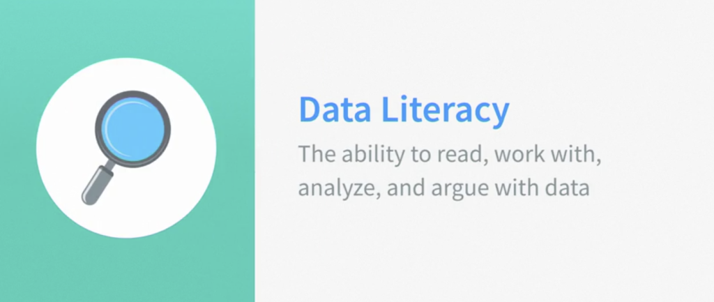
“You can’t manage what you don’t measure,” as Peter Drucker famously said. We know that data should be at the heart of every decision we make. We know this when it comes to our business, our health, and really most aspects of our lives.
Becoming an Information Designer
Becoming. Such a powerful, simple word. When it stands alone, it evokes something so much larger than simply “learning some skills” or “getting a job” or “focusing efforts on”. It’s much broader, more philosophical, more esoteric and ephemeral, in a way. (Perhaps that’s why it makes such a perfect title for an autobiography.)
Details Deliver Delightful DataViz

Data visualization has a broad definition. It simply means data that has been made visual. So this includes simple charts and graphs, complex data storytelling experiences, and large hairball diagrams that even the most sophisticated among us might have trouble deciphering. Heck, it even means when you ask a room of people to answer a […]
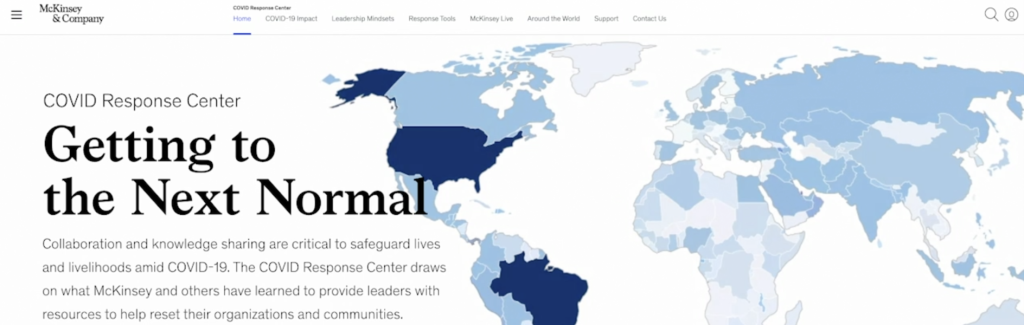
Data Visualization Can Save the World
Who knew when I wrote these opening words for this lesson that we would be in the midst of one of the great global challenges of a lifetime as I released it? Well, here we are. And data visualization has already played a key role in informing and persuading literally billions of people around the […]