How to Make Engaging Visualizations

If a tree falls in the forest… If you create content about a topic that no one cares about, and you do it in an uninteresting way, your audience will ignore it. So did it even exist?
The Greatest Debate in DataViz: Chartjunk
No term in the data visualization lexicon is better known than “chartjunk”. It was popularized in the 1980s by Edward Tufte, and has become the scourge of many a data visualization practitioner ever since–something to be avoided at all costs!
Data Visualization Tools of the Future
The toughest part about data visualization is everything that happens before you touch the keyboard on your computer. It’s about understanding your data, your audience, and your message. Then you need to really think about the insights you’re trying to bubble up for your audience and how best to represent those insights in a way […]
Diversity, Equity, and Inclusion in Data Visualization
Like many industries, the world of data visualization has traditionally been dominated by white men. But there have been great strides in diversity and inclusion among community leaders, practitioners, and the data stories that are being explored by the industry.
Visualizing Healthcare Data

After a production lull caused by the COVID-19 pandemic, we’re finally back with new episodes of this Lesson & Listen series. And, irony of ironies, our first episode after the pandemic-induced delay is focused on…healthcare data! OK, maybe not ironic, maybe expected…
Data-Driven Decision-Making is Da Best

Why do we collect, analyze, and communicate data? It’s a fun hobby! (I do enjoy doing it for fun, but I’m weird that way…) It’s for our health! (We can analyze data for healthcare, which is an upcoming episode…) It’s fashionable and we want to be on-trend! (Can’t argue with this logic. “Data is the […]
Art Is…Data? Data Is…Art?
Everything is data, in the end. We are all just bits, DNA base pairs, atoms, quarks… This is pretty reductive, but completely accurate. Art certainly is data. A paintbrush leaves strokes of paint, which can be reduced to just calculable wavelengths of light and the reflectivity of the surface, resulting in visual bits. Man, that’s […]
What Do Post-Punk Bands Have to Do With Visualization?
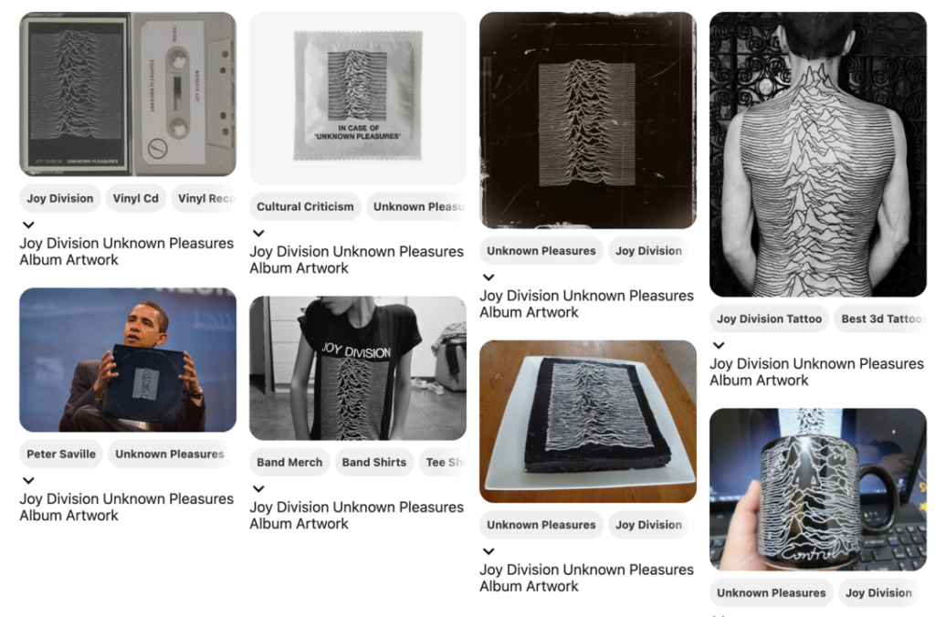
OK, that headline was total click bait. And yet…the connection is real. Joy Division used a visualization of pulsars from Arecibo Observatory as the cover art for its album “Unknown Pleasures”, which is one of the top album covers of all time. That visual (a horizon graph) had been published in a PhD dissertation in […]
Excel is the Tool Everyone Has…So Use it Well!
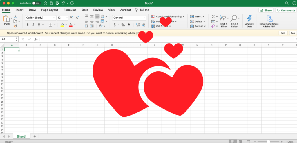
What is more ubiquitous than Microsoft Office? Probably the only software that is more common these days are web browsers. But those depend on platform – Chrome on Android, Safari on iOS, Edge on Windows, etc. So does everyone on Earth use, say, Safari? No. But everyone on Earth (pretty much…ish) does use Office.
What’s Harder than Color? Not Much

There are few topics in design or data visualization that are harder than color. Successfully designing with color is difficult, explaining and learning color theory is difficult, finding examples of designs that use color well…also difficult. It’s one of the hardest things to do well in all of design. And every single person I ask […]