Data Journalism Is Where It’s At (mic drop)
The headline says it all, kinda. Watch the episode for plenty more nuance in the conversation around data journalism: why it is doing the best work in the field, where the gaps and concerns are, where it’s going, and how this all relates to the work “normal people like you” (non-journalists) are doing.
Who Needs Formal Credentials for Data Visualization?
I’m “self-taught” in data visualization. I put that in quotes because I’m really not “self-taught”. I’m “community-taught”. There were people doing this before me on whose coat-tails I rode.
Everything We Thought We Knew Is Wrong…

The problem with investigating and continuously learning is that sometimes we find out things that might rock our worlds in large or small ways. For instance, if you were a doctor in the 19th century, your entire practice might have relied on leeches. As in, putting leeches on your patients to suck out their diseased […]
What if You Started with Data Viz?
What if, the next time you’re working with data, you start out by acknowledging that you are ultimately going to create a visualization that will be the core experience for your audience?
Visual Models Are For Thinking and Sharing
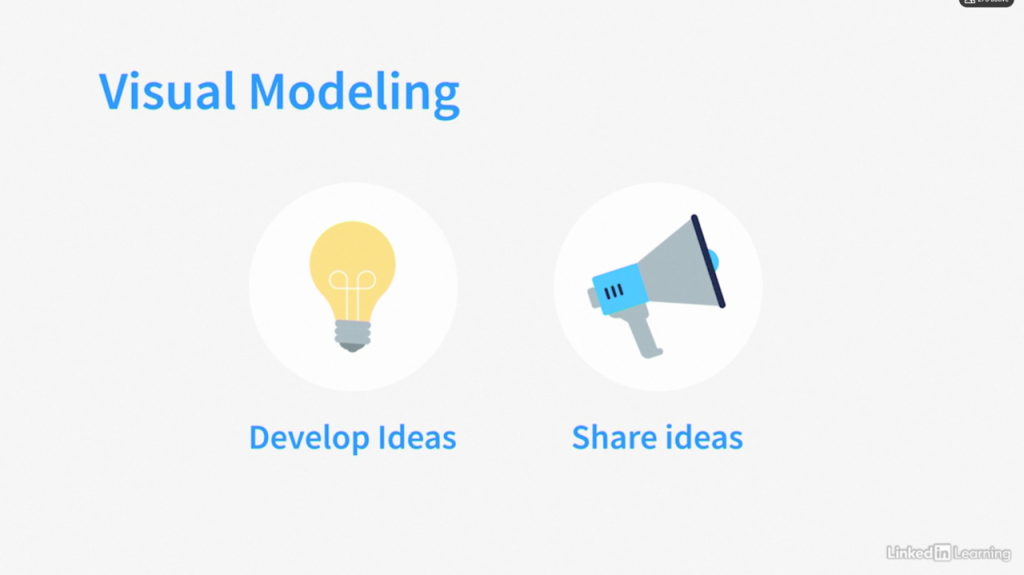
My newest course here on LinkedIn Learning is about Concept Visualization. That’s when you create a visual of a complex or abstract idea that is NOT data-driven. In this month’s episode of this series, I’m talking about a similar idea: visual models.
The Power of Community
I didn’t teach myself hashtag#datavisualization, even though I used to say I did. No, the community taught me everything I know. And this isn’t unique to hashtag#dataviz. Many of us who weren’t formally trained in our work learned because we were able to stand on the shoulders of giants who came before us, read the […]
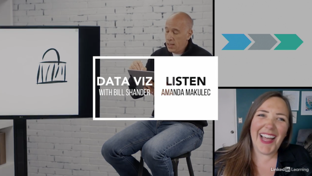
Listen to Your Data!
This series is all about the visual experience. It’s literally in the title! My entire career has been built on creating visual experiences. And humans are primarily visual creatures and visual learners. Visuals are the best!
Making Data Visualization Accessible
Accessibility has NOT be a top priority for just about anyone in just about any industry. The world marches along, catering to the most common denominator, trying to attract the largest audience by reaching everyone as broadly as possible, while expending the least amount of effort. But every now and then laws change, or the […]
Let’s Talk About Process
Blech. Process. So boring. Who wants to talk about process? Actually, process, methodology, frameworks…they’re everything. There are very few things in your life that you truly do without any pre-ordained process of some kind. Some things feel rote and automatic, like your bedtime routine, but I bet you follow pretty much the same process every […]
This is Your Brain on Data Visualization
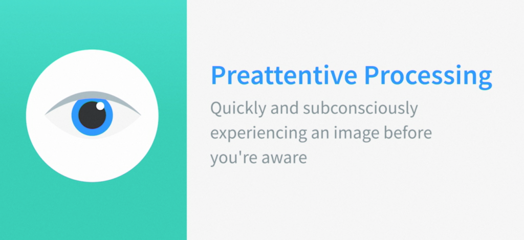
“If you understand how people see stuff, you can design better stuff…and therefore have a stronger impact,” as I say in the interview with Tamara Munzner below.