Simplicity has won out over complexity. Many of the best consumer products are simple and elegant. Simple processes are preferred to the complex, artisanal foods are faddish. Everyone naturally seeks out the simple because simple is just better, right?
Well, yes and no. The world also requires complexity. While we may crave simplicity, and the marketplace clearly demands it right now, the fact is that there is a place for complexity. Some things are not, and cannot, be simple.

Some examples? The engineering behind a nuclear energy plant is complex. Rocket science and brain surgery are complex, hence the clichés. Balancing budgets in a partisan political world intersecting with a variety of crises is complex.
In other words, the world is not black and white and while we crave simplicity, it is clear that some complexity is here to stay.

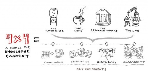
So how do you present complexity to people in a way that satisfies the need for simplicity without sacrificing inherent complexity in some things? At Beehive Media we use our 4X4 Model for Knowledge Content, which, at its core, is all about what we call “graduated complexity”.
You need to present simple concepts to people, allowing them to self-select based on interest, then guide them into the complexities of the topic. The simplicity is a filter, an attractor, allowing people to gravitate toward only that complexity that is of interest to them.
Graduated complexity is all about creating layers of gradually increasing complexity that people can navigate. The complexity is only revealed to those who seek it, to those who can handle the complexity. Have you ever been swimming in Maine? In June, the water is 50-60 degrees. Very few people can dive in. I know that I need to ease into it. Complexity is like Maine ocean water – you need to ease people in before expecting them to fully commit.
For example, the headline for a deeply technical article on nuclear engineering might grab my attention, and then a graphic illustrating the engineering and an abstract about the concept might be interesting to me. But I will never read a 100-page whitepaper on the topic. I’m not interested in it and wouldn’t understand it (those are correlated, by the way.)

Instead, the headline and abstract – graduated complexity – would give me an out – the chance to exit at the right level for me before burying me in complexity that is beyond me. It would give me all the information I want and can handle, the message, and without dumbing down the topic for someone who wants that complexity (a nuclear engineer, for instance). It is possible to over simplify the content. Bad infographics are a great example of complexity being removed to the detriment of the story.
Graduated complexity is just a phrase that captures an old idea. Newspapers and magazines know that headlines and images grab you and that articles can only be a certain length to keep your interest. And yet so many people presenting knowledge content ignore these basic concepts.
Just remember the phrase “graduated complexity” and you’ll be able to present your content in a way to keep your audiences engaged.
What do you think when you go to a web site and you’re thrown to the wolves of complexity?
