There’s good data visualization and there’s bad data visualization. Rather than quote Supreme Court Justice Potter Stewart’s definition of porn (read Jacobellis v. Ohio), I think there is actually a very specific answer to the question what makes a good data visualization? It can be summarized in the acronym ASK.
A = Accuracy
First, a good visualization must be Accurate. I love to criticize Fox News’ many attempts to skew its charts and graphs to match its political agenda. One of the more interesting examples of this is from 2011 when they showed a chart implying that the unemployment rate under Obama was stagnant or rising when, in fact, it was declining.
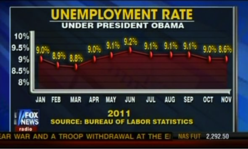
As Media Matters correctly pointed out, there were plenty of problems with this graphic. Fox News shows an “alarming pattern of dishonesty”, as they say. Specifically, their graph seems to intentionally put the dots on the graph in the wrong place to make lower numbers seem higher.
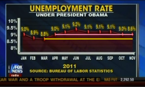
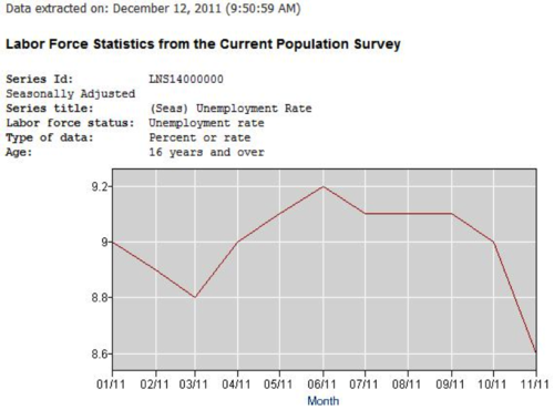
I would also argue that the scale was off (the y axis should have gone from 8.6 to 9.2 or maybe 8.5-9.5 at most, rather than 8-10, which over-emphasizes the static nature of the numbers.) The chart below is the one originally provided by the Bureau of Labor Statistics.
Accuracy is the backbone and a baseline assumption of any good visualization.
S = Story
Second, a good visualization tells a story. Edward Tufte (widely considered the father of modern data visualization) drew attention to Charles Joseph Minard’s famous visualization of Napoelon’s March as a quintessential example of visualization.
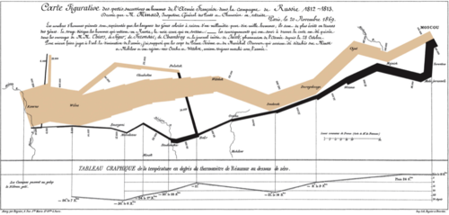
And once you’ve seen it, it is very unlikely that you will forget it. This is really due to the story it tells. In its simplest form, the story you can see is that as Napoleon led his army to Moscow in the winter of 1812-1813, he lost 300,000 men (75% of his army). When he decided to retreat, he lost most of those men who had survived the initial march. As Étienne-Jules Marey said, this graphic “defies the pen of the historian in its brutal eloquence”. That’s story-telling.
K = Knowledge
It seems obvious that a visualization should impart knowledge. Rather than a pile of papers or a thousand rows in Excel, a chart boils down the data to its essence, with the story visible at a glance. But it’s not always true that a visualization provides knowledge even if it is accurate and is telling a story.
Consider the New York Magazine graphic explaining four decades of the trials and tribulations of All My Children’s 200+ characters. I’ll take it as a given that it’s accurate. And it certainly tells a story (I won’t judge the show by commenting on it) but whooee, it does not impart knowledge. It’s far too dense with information for me to really learn anything from it. In fact, it makes me want to nap.
ASK Yourself
So remember – the next time you have data to share and you’re thinking about visualizing it (which is a great idea, by the way), I recommend that you ASK yourself what makes a good data visualization. And act on that knowledge.