This post originally appeared on the Visme blog.
The moment you glanced at this post, you were judging it. Before you were even aware of it, you were judging how long it seemed, what colors are visible on the page and in the images, whether or not the visuals prompted any emotional response, etc.
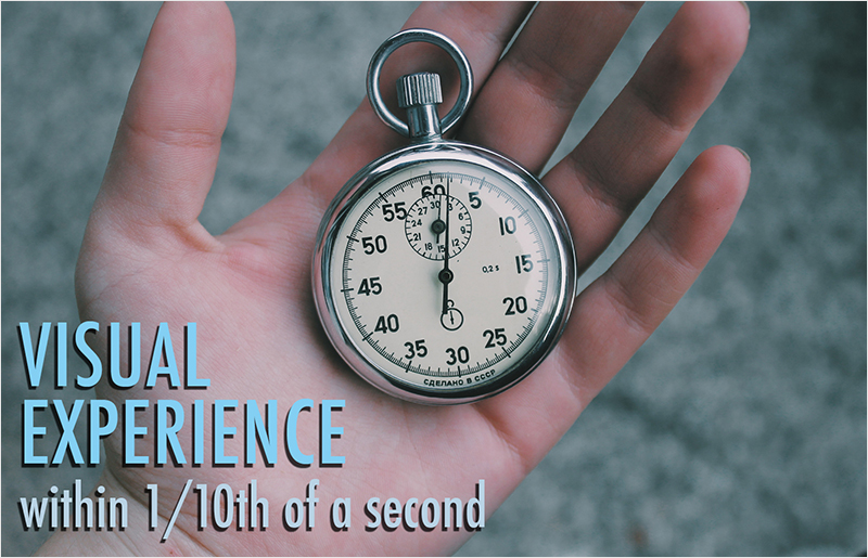
No matter who you are and whether or not you’re aware of it, every single time you’re presented a visual scene – whether looking at a web page, walking into a room or turning on your television, you start to make sense of that visual experience within 1/10th of a second. This is referred to as “pre-attentive processing” – you process visuals literally before you’re paying attention to them.
image: http://blog.visme.co/wp-content/uploads/2016/05/1-visual-experience.jpg
 The most effective data visualizations take advantage of the notion that humans are pre-attentive visual creatures – that before we’re even conscious of what we are presented, we are starting to make sense of things, judging the sizes, shapes, colors, contrast, etc.
With this in mind, you should carefully consider the design choices you’re making and whether or not your visuals are bringing clarity or causing confusion during that pre-attentive period. The more clarity you can bring to that pre-attentive brain, the more likely you are to provide incentive and direction to users to continue to explore your content, thereby revealing more information and knowledge to them.
Here are 3 quick go-to techniques that I recommend you carefully consider on every project to most successfully capture your pre-attentive audience’s attention and interest.
1 KWYRWTS
image: http://blog.visme.co/wp-content/uploads/2016/05/2-KWYRWTS1.jpg
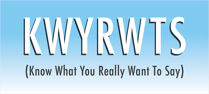
The most important thing you can do for any communications task is to actually Know What You Really Want To Say. This is my “worst-in-class” acronym KWYRWTS (pronounced “k-whir-wits”). It’s a mouthful and hard to type, and impossible to remember. But, it is the most important thing you can do. You have to know your message before you can communicate anything to anyone. This applies to all of life, not just work.
For instance, if I go to McDonald’s and step up to the counter and start talking about the weather, politics or even if I’m semi-on-topic and talk about spaghetti and meatballs, I’m wasting everyone’s time (not to mention pissing off the people behind me in line). I need to do what I’m there to do, which is order some burgers and fries.
So how does KWYRWTS apply to data visualization? I can’t just decide what the data is saying – this isn’t about lying with your numbers. The point is that you need to understand what you’re trying to accomplish with your visualization.
Why do we visualize data? The only reason is to reveal patterns, outliers, trends, correlations and make comparisons that can’t be easily (or at all) found when looking at a table of numbers. But the devil is in the details here.
For instance, say your boss handed you 12 quarters of financial performance data for your company and said to do a report for your CEO. What do you do? Your first instinct might be to create a line chart with 12 data points for gross sales, profits and stock price. But this is allowing the data you have in-hand to drive your decision about what chart to use, what data to share, etc. This is not a strategic approach.
The right thing to do is to first find out what is the purpose of the report. Ask yourself:
- What business conditions are being investigated?
- What decisions does the CEO need to make based on this report?
- What other data might you have access to to help her make those decisions?
- Imagine the answer is that the Widgets Division has been losing money for 6 out of 12 quarters and she needs to figure out whether or not to shut it down, invest in it or leave it alone?
- Now what might you do?
Well, maybe you need to do a quarterly report but break it out by division … and maybe it’s less about the gross sales and all about profits … or maybe it’s all about the fact that the world’s demand for widgets has gone down, as it always does when gas prices are low, but the coming spike in gas prices will surely result in a rebound of widget sales, so a fuel price prediction data display along with projections about widget sales would be most appropriate.
KWYRWTS is the most important first step in any project. And knowing that your CEO’s attention span is short, and she has to make 20 tough decisions before lunch, so her pre-attentive mind may be even more finely-tuned than most, means that you have to be very aware of what that chart says to her in the first 1/10th of a second as well as what a deeper investigation into the numbers might reveal. If she sees dipping lines but they’re the wrong dipping lines, her judgment within that 1/10th of a second can be skewed incorrectly.
2 Simplicity in Design
image: http://blog.visme.co/wp-content/uploads/2016/05/Vision.jpg

Designers intuitively know that less is more. Embrace white space. The eye needs a place to go between all of the content. Don’t overwhelm your audience.
There are a lot of arguments for this simpler visual aesthetic. None is more important than your pre-attentive audience. As I’ve said, the moment someone glances at your data visualization, they are judging it. What are they saying to themselves in that split-second (subconsciously)?
- “What’s most important?”
- “What should I look at here?”
- “What should I ignore?”
- “Is this too complicated for me?”
- “Is this too long and not worth my time?”
- “Does this seem credible?”
- And more…
Research has shown that one of the most important factors in infographic design is to understand your audience’s peripheral vision – that what a user can see at a glance is what will determine where they look next. In other words, in a pre-attentive way, you need to not only attract them to a specific spot on your visualization, but also be aware that you need to give them something to look at next!
The best example I can think of to explain this idea is to think of a map interface. You’re mapping the locations and ranking of restaurants. So you have dots on a map, but you want to indicate how good they are as well, so at a glance, your audience can determine the best restaurants.
Imagine that you have 100 restaurants on this map, and each has up to 5 stars next to the icon. That’s a lot of visual distraction and will be overwhelming for your users – especially in that pre-attentive moment. You would be better off leaving off the ranking or just using color or contrast to indicate relative scoring rather than trying to squeeze in that much visual information to the interface.
3 Labeling
image: http://blog.visme.co/wp-content/uploads/2016/05/4-labeling.jpg
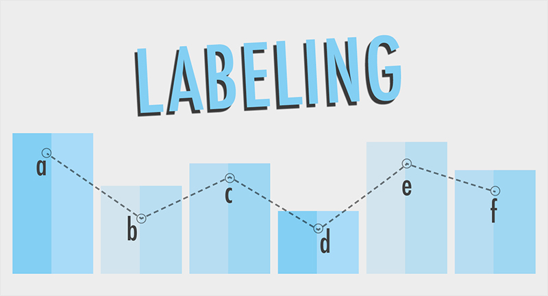
Just as in the previous example, less is more when it comes to labeling. For similar reasons, but it goes beyond leaving white space and reducing visual clutter with fewer elements. You should always think of your labels as “nice-to-haves” that need to be argued into the graphic. The assumption is NO LABELS, except as absolutely required.
image: http://blog.visme.co/wp-content/uploads/2016/05/comparisonfinal.jpg
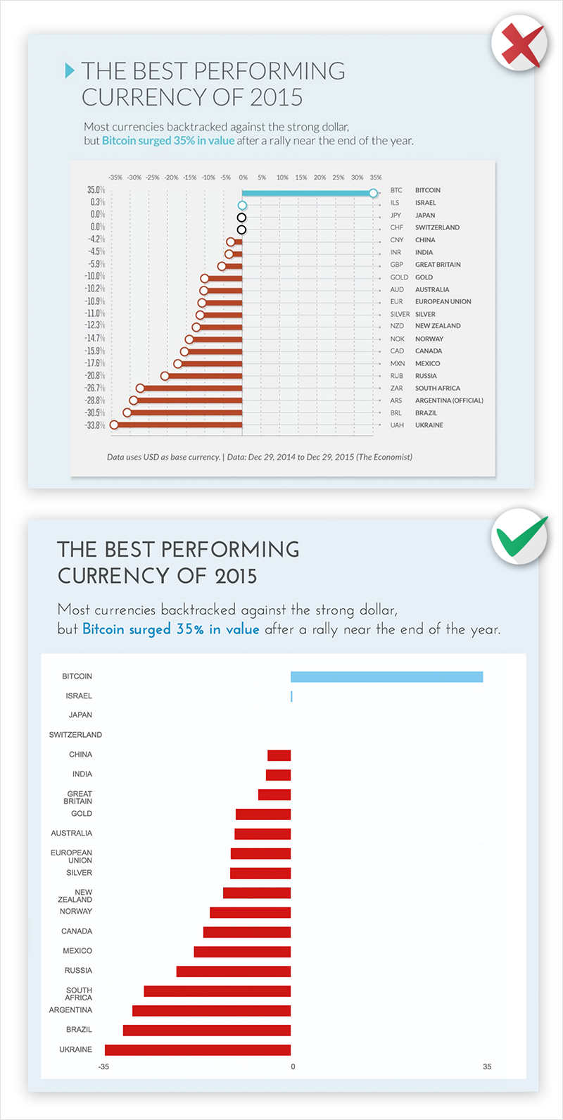 To me, the perfect chart has nothing other than a few shapes on it. Everything is relative. I can tell how much bigger one thing is than another even though I don’t have actual values. Now your boss and your data people will argue strenuously against this philosophy. They will say a chart with no numbers is a complete waste of time and absolutely ridiculous. OK, then, you will ask them, what needs to be labeled? (By default nothing, now convince me what MUST be included.)
At this point, they will say everything needs to be labeled, and the axis lines need 20 tick marks, and we need that grid in the background so I can see where every dot lies within the chart so I can identify the actual values for every single one within 10% accuracy.
Hogwash. If everything is important, then nothing is important.
Label only what MUST be labeled. Label the four points on the chart that matter. The axes probably just need two tick marks each (0 and the max value), and the axes can probably be in light grey and not bold black like the other labels and you can probably remove the grid lines behind the data.
In fact, all the labels can be light grey and smaller except that ONE dot that represents that ONE data point that is the entire purpose of this chart. (Remember KWYRWTS? That will help guide what gets labeled and how it will be emphasized visually.) Oh, and while we’re at it, let’s kill that key down in the corner and use inline labeling to explain any colors and shapes on the chart.
Your pre-attentive audience now has fewer things to judge, and is more likely to find the right thing to look at for that precious 1/10th of a second, which will help them stay and look longer and focus where you need them to focus.
Think of your next project as an opportunity to test your 1/10th of a second design skills. And try looking at your own chart quickly. Glance at it and try to judge it pre-attentively. It’s hard to do, but designing while considering your quick-glance audience as well as your deep-research audience is very effective. Because, don’t forget, everyone is the former, while only some are the latter.